
A stem and leaf plot is a sorting of numerical data to help visualize how the data is distributed. It also help people prove or disprove hypotheses.
http://www.learner.org/courses/learningmath/data/session3/part_d/histogram.html


 Windrose show direction of wind, wind speed, and the resultant vector. This particular one is from Seattle.
 Population profile, or population pyramids, graph the population as a whole and then is divided in a desired way. This graph shows population of men and women of the world living with and without AIDS.
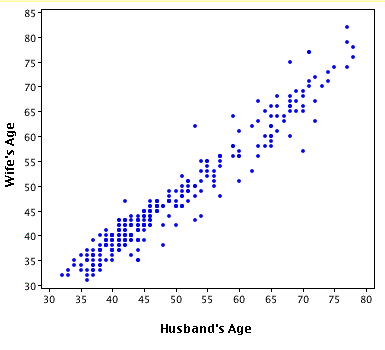 Scatterplots place a single dot on the X and Y axis to display a relationship. This relationship is the age of a husband in relation to the age of his wife.

 Bilateral Graphs display two different data sets in the form of two line graphs shown in the same scale and set of axis. This one displays nominal data.


 This Map measures continuous change in urban populations using proportionally sized circles.
 This is a black and white Digital Orthgraphic Quarter Quads image. It is used to help plan for flood insurance in Texas.

 This is a Digital Raster Graphic. This type of imagery is used as a U.S. Geological Survey. This one represents the Colorado River area. These maps have many GIS applications.


 Isobar maps are used by Meterologists to show different atmospheric pressures locally and around the globe.


 IR aerial photos enable people to see large portions of the earth and detect environmental changes. This IR photo is important because it is of the Sonoma wine country; any changes in the environment would change the quality of the wine produced in the region. So, these photos are vital to the constant care for the Sonoma Wine industry.


 This isoline map discribes the "lag precipitation". Continuous lines connect specific values for quantitative data and numerical data.


 Hypsometric maps employ tinting and shading to identify elevation changes. This map is a Hypsometric map of a city in Brazil.
 This Public Land Survey System map is for Alabama. Grid lines are used to show land ownership. This was also used to divide up land as people began to move west. Franklin county is highlighted in blue.


